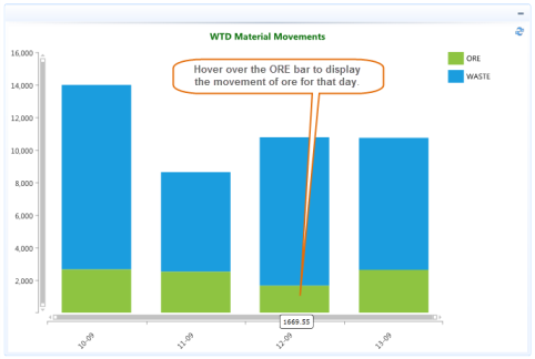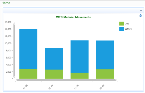
The Dashboard can display charts, like the WTD Material Movements one below to represent data in an easy to view graphical format.
In the above example the total volume of material moved for the current week is represented using a stacked bar to display the different materials moved for each day.
Charts may be resized so that you can zoom in on the data by:
Resizing or moving the scroll bars on the X-Axis and Y-Axis
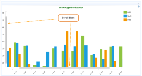
Moving the Mouse wheel forwards will zoom in on the data, whilst moving the mouse wheel backwards will zoom out.
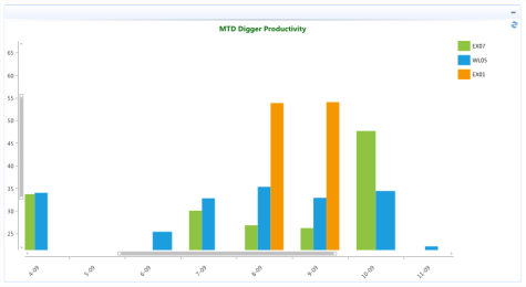
Note: Both scroll bars will be adjusted as you move the mouse wheel.
Highlight a section of the chart by clicking and dragging the cursor to zoom in on the data within the selected rectangle/area.
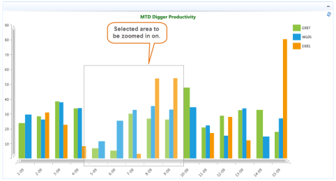
The chart will be re-sized / refreshed with the selected area.

It is possible to display the values behind the chart series by hovering over a legend entry or clicking on an individual series.
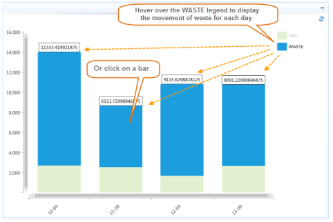
Hovering over an individual series will display the value for that series.